Make column filtering more obvious and powerful
When you filter a grid on a column, sometimes that column isn’t visible until you scroll horizontally. So it’s not obvious which column(s) are being used in the filter. Further, turning the filter icon blue is the only indication that a filter is applied and that isn’t always obvious.
My proposal would be to change the filtering of any grid to work as follows:
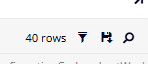
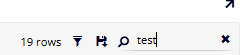
The magnifying glass icon would be an “all columns all rows” search of a string. Upon clicking the icon, you can type directly here to filter. Clicking the X clears it out. This is a quick way to filter and can be very useful - we don’t have anything like this today to search across the entire dataset for a string.
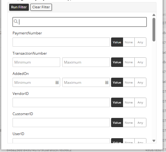
If you want more targeted filtering, clicking the filter icon would pop open a window. Depending on datatype, you can either type in a string, select a date, T/F, number, etc. In addition, “None” aka null or “Any” aka not null. The ‘Clear Filter’ is also very useful - unlike today when you have to go into each column filter and unfilter it individually.
Once applied the filtered value(s) appear at the top middle of the screen - very obvious. To clear it out, simply click the X (or reclick the filter icon and change the criteria)

Log in to comment and vote
Comments2
John Sanders
Oct 23, 2025
@jay.hornback@syniti.com Completely agree. I have flagged this ticket as part of our efforts to standardize grid functionality across the platform.
jay.hornback@syniti.com
Jan 8
@John Sanders I know different parts of ADMM have different histories, teams building, codebases, etc. But I’ve counted at least 5 different ways of column header filtering across the platform (it came up with the client again yesterday). So just piling on that documentation into this feature request.
Column header filters need to work in a consistent way across ADMM – Software Support